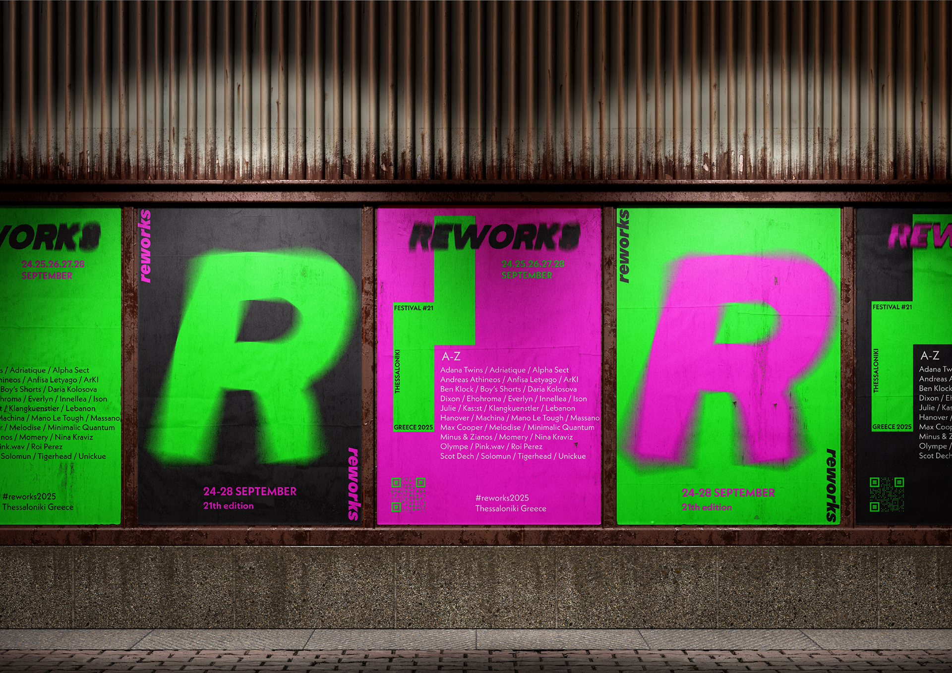
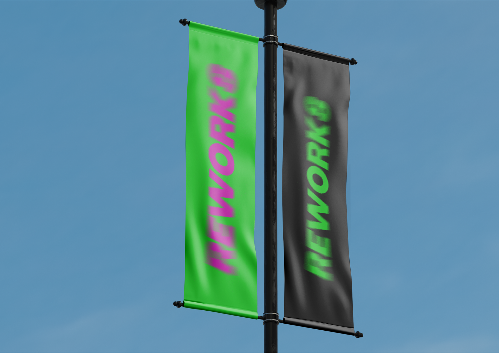
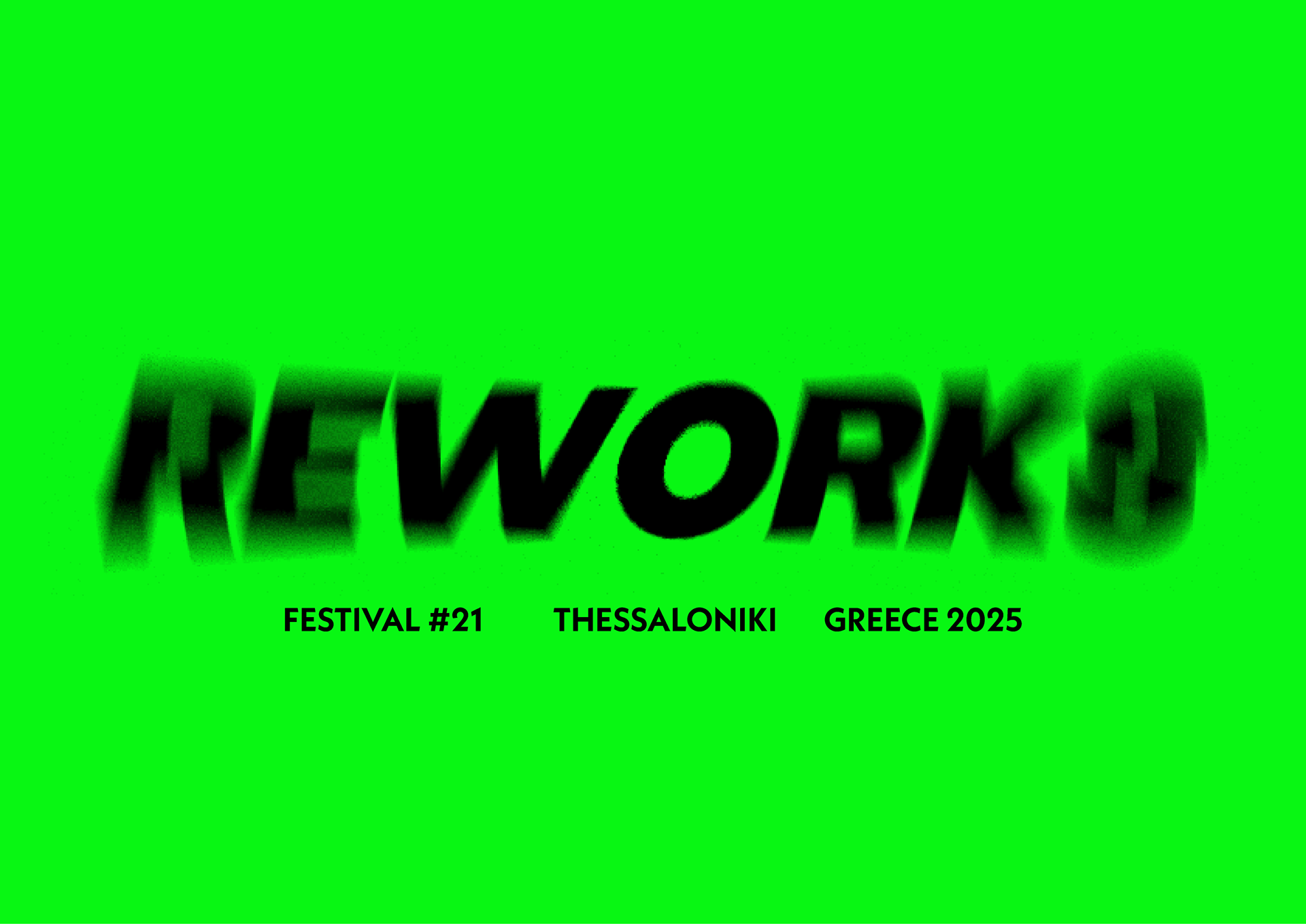
Concept: Reworks Festival is one of Greece’s leading festivals for electronic music and contemporary culture. The rebranding project aimed to reflect its dynamic, international spirit while staying rooted in Thessaloniki’s raw, urban energy. The concept “amplified urban energy” became the core of the identity, a visual interpretation of rhythm, digital culture and nightlife intensity.
Goals: To create a bold, recognizable and adaptable identity system that communicates Reworks’ dual nature: music and culture, day and night, local and global. The visual system needed to work across digital, print and environmental applications, from posters to social media and signage.
Role: I developed the full visual language of the rebrand including logotype design, symbol system, typography, color palette and layout principles. I also created festival applications such as mock posters and merchandise.
Outcome: The wordmark uses a radial blur to simulate sonic vibration, conveying motion and pulse. A custom “R” becomes a flexible symbol for digital use. Two slanted parallelograms, referencing direction and movement, are used throughout the system to reflect the duality and flow of the festival. The bright neon green and fuchsia palette evokes the immersive intensity of the electronic scene, anchoring the brand in a vibrant, contemporary atmosphere.
Tools: Adobe Illustrator, Photoshop


The original branding relied on minimal typography and a dark, subdued palette. While it offered consistency, it lacked vibrancy and failed to capture the festival’s experimental nature and youthful energy. My rebranding approach aimed to infuse the identity with a bolder visual rhythm, one that resonates with the dynamic spirit of electronic music and the festival’s audience.